PRODUCTION OF COLOUR TEACHING MATERIALS FOR THOSE WITH COLOUR VISION DEFICIENCIES
The problems experienced by persons suffering from colour vision deficiencies are usually overlooked by authors preparing colour slides and overhead transparencies for teaching and conferences.
These guidelines aim to assist you in choosing the most appropriate colour combinations so that the maximum percentage of your audience can read your slides accurately and easily.
Many different colours can cause problems for the colour vision deficiencies; it depends very much on the type and severity of the affliction.
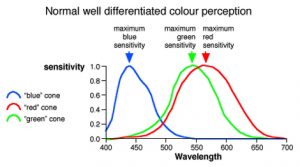
People with normal colour vision are able to differentiate colour through 3 colour sensitive light receptors in the eye. The receptors are sensistive respectively to red, green and blue incident light.
The spectral response of the 3 receptors is shown below:
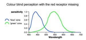
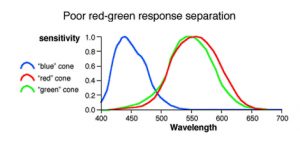
Colour vision deficient persons may have one or more receptors missing or more frequently the receptor responses are less separated so that colour differences cannot be perceived or can only be seen with great difficulty.
In the most common form – ‘red-green’ colour blindness this means that sufferers at best will have difficulty distinguishing colour differences in the red-green part of the spectrum so that separating reds, greens and yellows is extremely difficult. At worst, sufferers will only perceive blues, yellows and shades of grey in between.
The problems are increased when a PC is used to generate the slides as the image when viewed on the PC screen bears little resemblance to the results achieved when the file is printed. On a PC screen yellow, green and pale blue colours will actually appear much brighter than they will print, because most PC screens are very insensitive to red.
In the same way that colour television signals produce a black and white image on a black and white television, if a colour blind person cannot respond to a particular colour they will see a grey image. In this case the brightness of the original colour will determine how light or dark that grey appears.
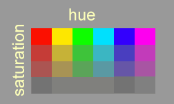
Every colour can be defined by 3 properties:
- Hue – type of colour, ie red, green etc
- Saturation – depth of colour from grey
- Luminance – brightness
Our perception of brightness depends mainly on the eyes combined response to the red and green receptors.
This means that if a red green colour blind person perceives two colours to have the same brightness they will not be able to distinguish between them, unless the blue receptor is stimulated differently, eg ‘yellow and bright green’ have a similar ‘blue’ content so will appear as the same tone of grey. A yellow and a darker green with a high blue content, will appear as a pale and dark grey and will be able to be distinguished as separate parts of the image.
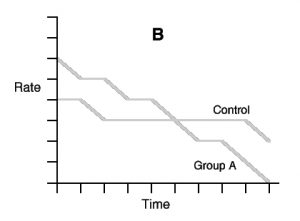
When these are colours used for data lines in graph A (against any background) they could look identical to a red-green colour blind person (graph B). As a result, the information in the graph would be completely misinterpreted.
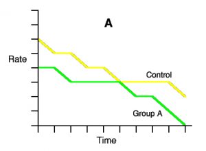
In spite of the lines being clearly labelled, it would be quite reasonable to assume the control had a shallow fall and that the lines were supposed to cross!
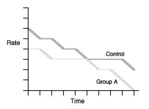
If dark orange and yellow lines had been chosen the graph will now be accurately perceived by a red-green colour blind viewer as below:
Colours that differ greatly in luminance will be able to be readily distinguished from each other by colour blind as well as normal sighted viewers.
It is important therefore to be aware of both (hue) differences and luminance differences when designing slides.
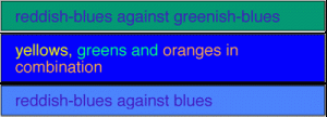
Good Colour Combinations
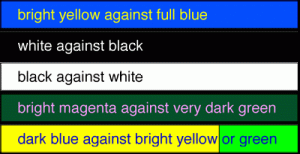
For text against a solid background:
For colour coding multiple lines or bars in a graph choose colours that differ in ‘blueness’ and or ‘brightness’ from each other and against the background.
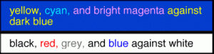
Bad Colour Combinations
Avoid these combinations in text or figures: